ROLE: UX/UI DESIGNER


Milsig is a paintball company catering to a small niche community that plays exclusively with magazine-fed paintball markers.
I compared the old website with other companies' websites within the paintball industry that are widely known for moving the most product. I looked for how Milsig fell short in their design and layout of the website and also lack of call to actions.

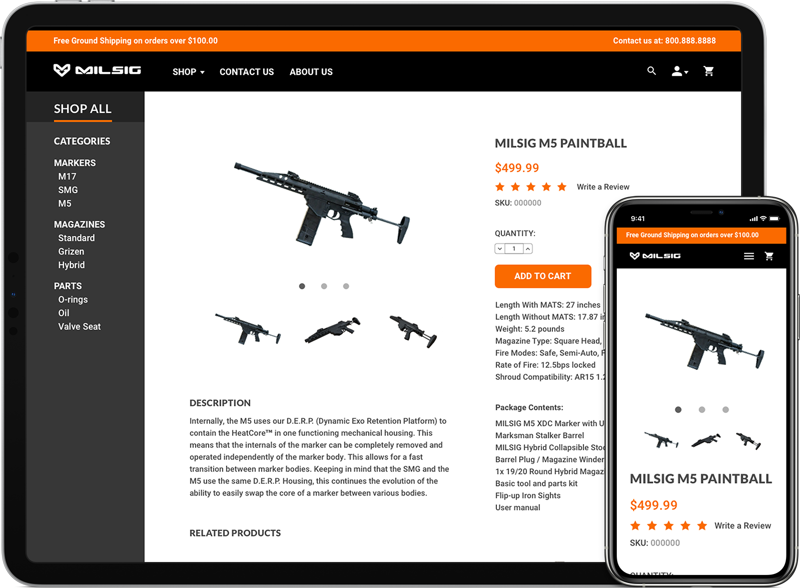
Milsig was one of my favorite companies within the paintball industry. After they went out of business, I wanted to dedicate a newly designed website in their memory. While doing so, I sought to solve the problems the old website had that may have prevented them from making the necessary sales.
Unlike the old website, I strategically placed call-to-actions where necessary, such as on the main banner and across the entire website where the eye would draw attention to. My version is also much more visually stimulating by placing people in action with the paintball markers. Users can relate to the images and place themselves within the same environment. The navigation of the website is also fixed with a modern and easy-to-use layout. Lastly, all of the important content has minimal scroll travel.
